Loans 2 Go are a nationwide consumer lending organisation with over 55 stores around the UK offering unsecured consumer finance, short term loans and logbook loans.
Loans 2 Go chose Xcite Digital to create an effective User Experience guide for Loans 2 Go Loan Application Form, to generate more loan enquiries online, help increase conversions by creating a positive user experience, whilst utilising Loans 2 Go’s branding and colours.
One of the key priorities for the task was to improve the application process for the customer, so take a look at how we went about the task!
One of the first things we did was look at their current application form to see how this could be improved. Some of the things we took from this were:
General Appearance
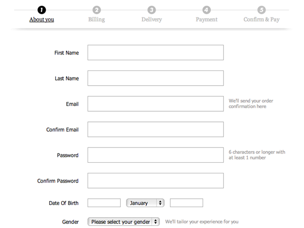
We decided that the general appearance of the UX form would be better if the column was centred. We also found that the width and height of each field should be increased on both mobile and desktop and follow a similar layout to the form below, so we followed these steps.

Validation
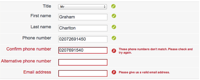
We found that inline validation is easier to read and understand, so we adjusted the forms like this. Another thing we found is that we also needed to make sure the error messages were easy to understand. This was for a variety of reasons including English being a second language for some users.

Clearly labelled input fields
It was important for us to make sure that input fields were labelled clearly and used different copy to the field title. This was to avoid confusion and to improve the form’s scan ability once it had been filled in by the user

Security Icons
It is important to provide security icons to the right of the form fields, notably next to the bank sort code and account number. The main reason we did this was to reassure customers that it is safe for them to add their details on to the site, as obtaining these details can be stressful for some customers.
We also thought it would be a good idea to have a few more icons on the home page that show the encryption that the site uses, or how Loans 2 Go are authorised to take these details.

Alternative Statement Upload
One thing we recommended was that Loans 2 Go provide alternative options for customers during the process, such as uploading pdf copies of their 90-day bank statements.
Auto Expand Down the Page
Instead of having several pages of the application form for customers to fill in, we decided to use Ajax to load everything into a single page.
The way this works is that everything is on one page, but is hidden until the user enters that section. When the section is open, the user can scroll through this content, but it is hidden otherwise. This makes the page seem easy to follow at the beginning, and allows users to go back and easily see where to edit later without having to leave the page they are on.
Feedback
We decided it would be a good idea to allow users to provide feedback if they feel there is an error in the application form or an error during the application process. Feedback options on the form are a great idea because customers are likely to find another way to voice this if you don’t give one, such as calling up or voicing the complaint on social media, which can have a negative effect on a brand.
Colours
We decided to reduce the amount of colours on the form and provide flat design features where possible, like below:

The colour form is replaced and becomes something like:

Saving/Editing
Many users will not complete the loan application form, so it is a good idea to provide a way for them to save their application form and come back to complete it at a later time/date. This should be made prominent throughout the form.
This can then be used to remind users to finalise the forms (if not already), and it captures the visitor’s details.
Headings/Fonts
We advised that Loans 2 Go should make their headings and font bigger as standard. Below is an example:

Icons
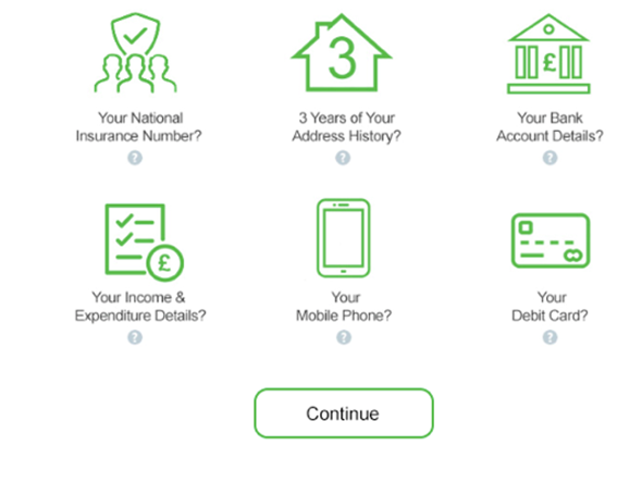
One thing we thought we should change about the form is to put all the icons on to a single line and include a tick box instead of a ‘?’ icon, if there is text below already explaining the what the icon means. For example:

Rather than

Tabbing
We notice on the current application form that users could not always tab to the next field, they would tab to the ‘?’ icon rather than the field, so being able to tab correctly would be a large improvement to the form and the overall user experience.
Loan Value
Making it very clear how much the loan is for at the beginning of the form, and allowing users to remind themselves numerous times through the form will improve the experience for applicants.
Do you have a project you would like us to take a look at?
Contact us today!
Author: Rob Walker

