8 years ago we started as a Design and Build agency, crafting websites to help our clients convert more customers. We became very good at this, taking on bigger projects and creating a name for ourselves.
Whilst we grew we evolved our business to find customers for our clients, as well as focusing on conversion through their website.
This work involved understanding our clients business models, helping to differentiate them and working out the most cost effective way for them to reach qualified customers through activity such as Paid advertising, Organic Search, Social, Content, and Email marketing.
Running these services for our clients meant we could interact with their consumers at different stages of the buying cycle, presenting the right messages at the right time.
By tracking these figures we visualise the sales funnel, giving us the ability to make informed decisions and improve performance.
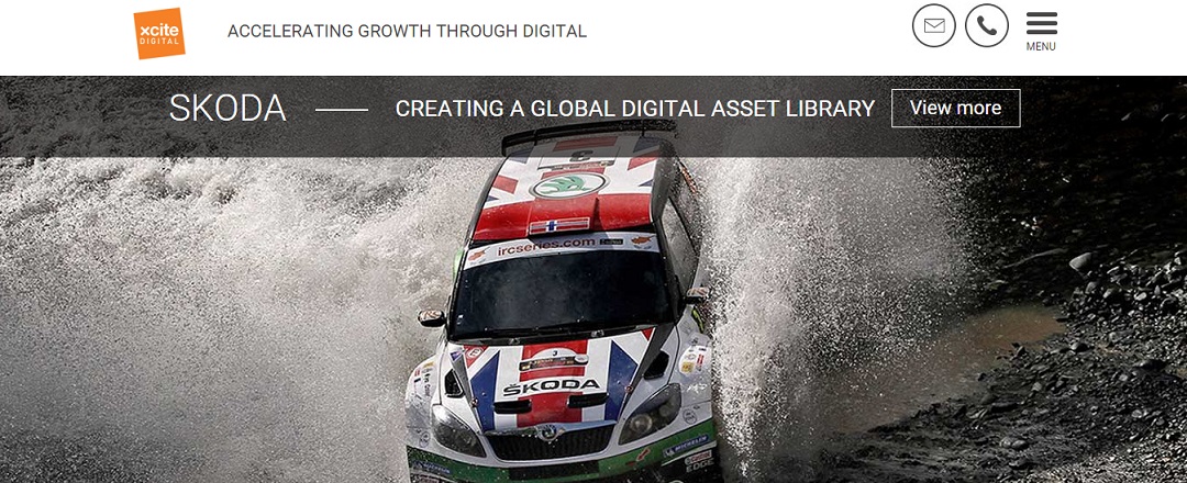
To reflect these changes we updated our new website, we would be delighted to hear any feedback. Please read on to hear the thoughts from our team.
“My team and I have worked hard on the website coming up with a design and build that powerfully represents the digital marketing activity we do as a company.
The website has been designed to raise awareness of what we are great at, focusing on you as a visitor by promoting a simplistic navigation that works across device and platform.
We are visual people so wanted to promote our content and imagery with subtle functionality, using clean lines and good use of white space to leave the site feeling open and easy to digest.”
Robert Walker, Managing Director
CREATIVE
“We wanted to design a site that not only showcased our talents as a team, through the content, but would also be simple to navigate. The main landing page was key, with the emphasis on using eye catching imagery. I am thrilled with the outcome, it looks fresh and clean.”
Darryl, Lead Creative.
DEVELOPMENT
“Making sure all of the design elements work seamlessly together and taking everyone’s input sometimes feels like pushing square pegs into round holes, but it was nice to put the energy into developing something of our own.”
Andy, Developer
USABILITY
“It was an exciting project to take part in as it opened up new opportunities for us to demonstrate our creative flair and aptitude for usability! Even though it was a struggle getting all the different elements to come together.
We’ve introduced a number of pages in the site that help to break down who Xcite Digital are and how we tailor our digital marketing services to our clients. Our objective was to create a visual feast for visitors while they learn more about us through our easy to digest information.”
Nahida, Project Manager
“My ‘favourite’ part of the site is the ‘Work’ section as it not only illustrates the diverse selection of industries and sectors we have had the pleasure of working with, but the layout of the individual case studies also clearly shows, in no uncertain terms, what we have achieved for that particular client and the results they have enjoyed.”
Emily, Project Manager
SOCIAL AND CONTENT
“We all have certain aspects of the design that we like, I love the insight section which is filled with informative research led insights that our content team produces, along with my team’s social marketing activity which gives us around 50% of our monthly traffic so is really important to maintain and extend.”
Amy, Marketing
“We hope you like it as much as we do!”
Rob.


